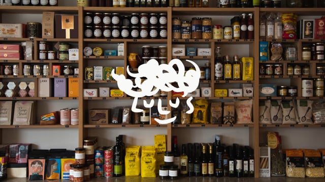
As the sister site to long-standing neighbourhood restaurant Llewelyn’s, this playful little sibling offers a more intimate setting for its loyal following in both deli and restaurant form.
The founder Katya Milavic Davies and chef Lasse Petersen approached us to create the branding for Lulu’s, stating only that its relationship to Llewelyn’s should be conveyed, but not made explicit.
From creating the anthropomorphic logo to defining a playful, accompanying typographic style for print and packaging, we gave Lulu’s a face to its name; one filled with personality, in turn helping it to quickly become a cherished part of the local community.